Burndown chart
| Line 6: | Line 6: | ||
===What is it? What is the purpose and motivation for using it?=== | ===What is it? What is the purpose and motivation for using it?=== | ||
| − | [[File:Burndown_chart_example.png|380px|thumb|right| | + | [[File:Burndown_chart_example.png|380px|thumb|right| Example of a Burndown chart]] |
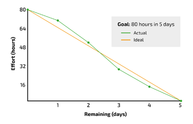
The Burndown chart is a graphical tool that can be used to monitor the progress of a project that is being carried out. It assists in detecting delays, according to the schedule, early on in projects. This enables managers to make suitable measures ongoing when the delays have transpired. The Burndown chart pictures the remaining work to be executed in relation to the remaining time of the project until the planned completion of the project. An example of a completed Burndown chart can be seen on figure XX. By using the chart and thereby continuously tracking workload progress throughout a project, it provides a clear picture of how far the team is and whether they can meet the agreed upon completion date.<ref name=Hofmann2021 >[Hofmann, M. (2021). Tools for the Optimisation of Workflows. A Holistic Approach To Process Optimisation, 61–120.] https://doi.org/10.1007/978-3-658-34097-1_4 </ref> If delays occur, that cannot be corrected or caught up with, the chart is able to provide a new delayed completion date. The Burndown chart might be an effective tool for project managers when communicating project progress to e.g., senior management, program, or portfolio managers, since it makes the work progress explicit and quantifiable. However, there might be a lot of uncertainty up-front using the tool, since project managers might not always be able to make correct estimates, since a lot of different aspects can affect the progress during the project. | The Burndown chart is a graphical tool that can be used to monitor the progress of a project that is being carried out. It assists in detecting delays, according to the schedule, early on in projects. This enables managers to make suitable measures ongoing when the delays have transpired. The Burndown chart pictures the remaining work to be executed in relation to the remaining time of the project until the planned completion of the project. An example of a completed Burndown chart can be seen on figure XX. By using the chart and thereby continuously tracking workload progress throughout a project, it provides a clear picture of how far the team is and whether they can meet the agreed upon completion date.<ref name=Hofmann2021 >[Hofmann, M. (2021). Tools for the Optimisation of Workflows. A Holistic Approach To Process Optimisation, 61–120.] https://doi.org/10.1007/978-3-658-34097-1_4 </ref> If delays occur, that cannot be corrected or caught up with, the chart is able to provide a new delayed completion date. The Burndown chart might be an effective tool for project managers when communicating project progress to e.g., senior management, program, or portfolio managers, since it makes the work progress explicit and quantifiable. However, there might be a lot of uncertainty up-front using the tool, since project managers might not always be able to make correct estimates, since a lot of different aspects can affect the progress during the project. | ||
Revision as of 11:48, 9 April 2023
Abstract...
Contents |
Big idea
What is it? What is the purpose and motivation for using it?
The Burndown chart is a graphical tool that can be used to monitor the progress of a project that is being carried out. It assists in detecting delays, according to the schedule, early on in projects. This enables managers to make suitable measures ongoing when the delays have transpired. The Burndown chart pictures the remaining work to be executed in relation to the remaining time of the project until the planned completion of the project. An example of a completed Burndown chart can be seen on figure XX. By using the chart and thereby continuously tracking workload progress throughout a project, it provides a clear picture of how far the team is and whether they can meet the agreed upon completion date.[1] If delays occur, that cannot be corrected or caught up with, the chart is able to provide a new delayed completion date. The Burndown chart might be an effective tool for project managers when communicating project progress to e.g., senior management, program, or portfolio managers, since it makes the work progress explicit and quantifiable. However, there might be a lot of uncertainty up-front using the tool, since project managers might not always be able to make correct estimates, since a lot of different aspects can affect the progress during the project.
Application
lolz
Limitations
lolz
References
- ↑ [Hofmann, M. (2021). Tools for the Optimisation of Workflows. A Holistic Approach To Process Optimisation, 61–120.] https://doi.org/10.1007/978-3-658-34097-1_4
