Burndown chart
m |
|||
| Line 54: | Line 54: | ||
Example: Now the actual work progress line can be added to the chart, to show the final progress of the project – see Figure 5. <ref name=asana /> | Example: Now the actual work progress line can be added to the chart, to show the final progress of the project – see Figure 5. <ref name=asana /> | ||
| − | + | ===How to use the tool in a project, how to read it and how to use it as a manager=== | |
Revision as of 11:36, 9 April 2023
Abstract...
Contents |
Big idea
What is it? What is the purpose and motivation for using it?
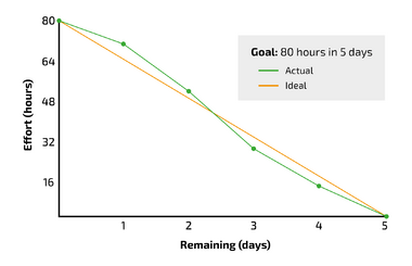
The Burndown chart is a graphical tool that can be used to monitor the progress of a project that is being carried out. It assists in detecting delays, according to the schedule, early on in projects. This enables managers to make suitable measures ongoing when the delays have transpired. The Burndown chart pictures the remaining work to be executed in relation to the remaining time of the project until the planned completion of the project. An example of a completed Burndown chart can be seen on Figure 1. By using the chart and thereby continuously tracking workload progress throughout a project, it provides a clear picture of how far the team is and whether they can meet the agreed upon completion date. [1] If delays occur, that cannot be corrected or caught up with, the chart is able to provide a new delayed completion date. The Burndown chart might be an effective tool for project managers when communicating project progress to e.g., senior management, program, or portfolio managers, since it makes the work progress explicit and quantifiable. However, there might be a lot of uncertainty up-front using the tool, since project managers might not always be able to make correct estimates, since a lot of different aspects can affect the progress during the project.
How does it relate to project management?
If we look at PMI's definition of a project, which states that a "Project is a temporary endeavour to achieve one or more defined objectives” [2]. Then we see two main elements, one being the 'temporal component' and the other being the 'defined objectives'. Both elements are what the Burndown chart is used to communicate in some way, which makes the tool ideal for use in projects. The temporary endeavour often refers to projects having an end or completion date - this is clearly visualized with the Burndown chart, since it will happen when all the work packages have been completed. The defined objectives are usually achieved with a set of activities, which can be translated into work package - this is depicted on one of the axes on the chart. So, in conclusion, Burndown charts relates directly to managing and communicating projects and their progress.
If we relate the tool to the iron triangle [3], the Burndown chart mainly takes its roots from the schedule/time perspective. This is due to the chart visualising the remaining work with time estimates, meaning that it can be used for scheduling different milestones or deadlines in the future. Since it is a continuous monitoring of the project, it relates directly to the time perspective. The chart can also be used to adjust the resource/cost/budget perspective, meaning that if the project falls behind schedule the number of resources can be adjusted to try to catch up to the original deadline. There might be critical deadlines that have to be met, which e.g., could include having the foundation prepped before the concrete-poring company would arrive, which could end up being very costly if the date was not meet. This could be addressed by adding extra people to the project, if this would enable the project to catch up, or adding extra monetary resources, granted that the reason for the delay of the project was due to limited money because of extra expenses. The Burndown chart can’t be used to communicating the quality/scope perspective, since the Burndown chart only measures if the work package has been completed or not, but not going into detail with the quality of the completed work package. It relates a bit to the scope anyways, since the work packages should contribute to the scope, however, the quality perspective is not really in focus with this tool.
Application
How to make a Burndown chart
When making the Burndown chart it is important to think about in what setting it should be displayed and used. This will help determine what format, being analogue or digital, it makes most sense to create it. Usually, it would make a lot of sense to make it on a digital platform, like MS Excel, since it is easy to use and easily distributed to the right set of people.
Making the Burndown chart is straight forward and is usually done in 4 steps:
Step 1: Estimate work. In this step the team in collaboration with the project manager determines the remaining work to be done to reach the agreed upon outcome of the project. This is usually defined as work packages, tasks, or story points (mainly used in Scrum projects). [4]
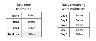
Example: Let’s take a simple example to show how it is done. In this step the team determines the tasks that needs to be done. The team locates three tasks, which we call Task 1, Task 2 & Task 3. [5]
Step 2: Estimate remaining time. Here the team, assess how much time each of the work packages will take to carry out. This is usually defined with a time unit, like hours, days, or weeks. Depending on the type of project, the degree of uncertainty of the time estimates might differ a lot. In terms of hand drawing the chart, this is where the vertical axis is drawn to the left of your canvas. The estimated work is listed on this axis.
In this step it is also defined when the project is ending. This is normally done based on the amount of work packages and the time they take to complete. This is drawn as a horizontal line at the bottom of the canvas, so the chart now has a y- and an x-axis. The time estimates are marked on this axis. [4]
Example: In this step the team has estimated how much time each of the tasks will take to complete. They have summed up the estimated total amount of time to 80 hours of work. The team has also agreed upon a completion date of the project, which is in 5 days. This means that they must work 16 hours a day on the project. See Figure 2. [5]
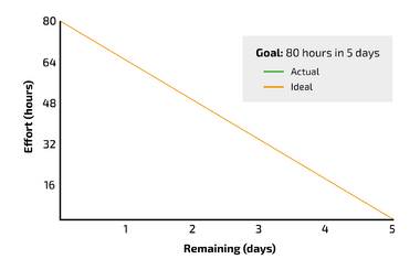
Step 3: Estimate ideal effort. In the third step, the ideal effort is mapped. Meaning that the optimal path for completing the project is added to the chart. The ideal effort is usually added as a straight line, since it is assumed that the estimated time is equal to the actual time it takes to finish the work. On the chart the ideal effort line is drawn starting from the top of the vertical axis to the right of the horizontal axis. This gives a down sloping straight line. [4]
Example: Now the diagram has been created, with the total amount of work on the y-axis and the number of days to complete the project on the x-axis. The ideal effort line has been added as a diagonal line in the chart, see Figure 3. [5]
Step 4: Track daily progress. The final step is to measure and monitor how the work is progressing and then plot it into the chart. Here the status represents the real effort compared to the ideal effort. The chart is only useful if it is updated on a continuous daily basis, since it needs to reflect the status, and displayed clearly and is accessible to the whole project team [1]. Ideally, all members of the team should be able to plot their data into the chart since they are the once doing the work and not necessarily the project manager. When adding the progress to the chart, it is important to distinguish the ideal effort line from the actual progress line, so make sure to use two different colors. [4]
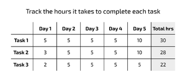
Example: In this step, the team has inputted how much time they have spent on each task each day, which can be shown in a simple table, see Figure 4. [5]
If the project contains decisive milestones or gates, they can also be added on the vertical axis of your Burndown chart (on the axis with remaining work packages). This is especially useful if you are working with a more intangible project, where it is challenging to provide precise workloads for each stage/iteration. [1]
Example: Now the actual work progress line can be added to the chart, to show the final progress of the project – see Figure 5. [5]
How to use the tool in a project, how to read it and how to use it as a manager
Limitations
lolz
References
- ↑ 1.0 1.1 1.2 [Hofmann, M. (2021). Tools for the Optimisation of Workflows. A Holistic Approach To Process Optimisation, 61–120.] https://doi.org/10.1007/978-3-658-34097-1_4
- ↑ [International Organization for Standardization (ISO). (2021). ISO 21500:2021 - Guidance on project management] https://www.iso.org/standard/75704.html
- ↑ [Pollack, J., Helm, J., & Adler, D. (2018). What is the Iron Triangle, and how has it changed? International Journal of Managing Projects in Business, 11(2), 527–547.] https://doi.org/10.1108/IJMPB-09-2017-0107
- ↑ 4.0 4.1 4.2 4.3 [Lucid Content Team. How to create a Scrum burndown chart] https://www.lucidchart.com/blog/how-to-create-a-scrum-burndown-chart
- ↑ 5.0 5.1 5.2 5.3 5.4 [Team Asana (2022). Burndown chart: What it is and how to use it (with example)] https://asana.com/resources/burndown-chart


