Sankey Diagram
By Sonia Guerra Loji (s203379)
The article's aim is to highlight the usefulness of the Sankey diagram in a project & portfolio management context. The article includes a discussion of the diagram's pros and cons from the Managements perspective.

Contents |
Abstract
Within project & portfolio management it has become even more important that leadership is able to visualize where resources are being allocated and used. This is in terms of simple supervision over the projects, but also to optimize the limited resources an organization has. The Sankey diagrams are a graphical way of visualizing the flow of resources in a team, project, process, company, etc. Resources mapped in a Sankey diagram can be anything from materials, monetary funds, people allocation, activities, etc.

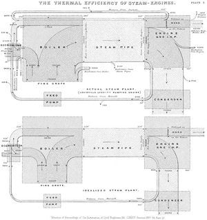
Beginning in 1898, the Sankey diagram was first used by an Irish captain named Matthew Henry Phineas Riall Sankey. This first implementation of the diagram showed the energy efficiency of a steam engine. [2] Nowadays there are four main implementations of the Sankey diagram. First, to analyze flow, flow being whatever has movement (like resources) in the scope defined by the diagram. Second, to analyze time-based patterns, this type can visualize the behavioral change of a specific persona, group, thing, over a specific time-lapse. Third, to analyze hierarchy type data, this is used when there are connected relations between the data but a hierarchy between the data has been defined. This hierarchy defines the order in which the data will be split and mapped in the diagram. And finally, the "quick trick" to replace Machine-learning, the Sankey diagram can be used to find and understand patterns in the data instead of using machine learning. [3] All four applications of the Sankey diagram can produce valuable insights to data in a visual and straightforward way to understand.
Correct application and automation of the Sankey diagram can provide fast and easy access to complicated data. The purpose of the article is to dive further into the possible applications and key characteristics of the Sankey diagram, as well as the benefits and limitations it can bring to upper management when making decisions in terms of resources and strategy.
Elements of the diagram
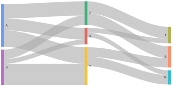
The Sankey Diagram is made up of five essential parts; this is flow, nodes, origin points, endpoints, and widths of the flow. As seen in the example diagram to the left, the nodes are identified by colored lines and letters. The nodes represent the activities, projects, people, etc. that are part of the visualized system. The flow of resources is visualized in the diagram by gray waves that connect the nodes, these gray waves widths represent the number of resources being passed from one node to another as well as the path the resources take through the system. This means that if the width of the gray wave is thin, few resources are being passed on to the next node. While if the gray wave is thick, a substantial number of resources are being passed on to the next node.
As mentioned previously the resources can be anything from money, human labor, materials, etc. The system as a whole can represent the flow of a process like a steam engine to the circulation of a global economy. For this reason, it is important to identify the origin points (where the system begins) and the endpoints (where the system ends). In the case of the example diagram, the origin points are nodes A and B, while the endpoints are nodes R, S, and T. In general terms the system flow should be read from left to right, and therefore when mapping the system's nodes the origin points should be towards the left extreme and the endpoints towards the right extreme. Depending on the program and style used to create the visualization, features like the color of the flow waves can be changed to resemble the color of the node it is originating from. Other more advanced features can be added to the code to create a more self-explanatory diagram, for the purpose of this article only the basics are mentioned.
Types of Application
Example in Portfolio Management
The main purpose of the Sankey Diagram is to visualize the flow of resources quickly and easily. This section will focus on how a Sankey Diagram can be useful in a Portfolio management case. First, there is a need to define some basic terminology used in a Technology Portfolio as this example is based on one.As many companies have transitioned from a traditional Waterfall methodology where actions are dependent on other actions to an Agile methodology where actions can be done in parallel, a new terminology like Epics and User Stories have been introduced [4]:
- Stories, "also called "User Stories," are short requirements or requests written from the perspective of an end user."
- Epics, "are large bodies of work that can be broken down into a number of smaller tasks (called stories)."
- Milestones, "are collections of epics that drive toward a common goal."
In a Technology Portfolio, Scrum Teams are formed to tackle the Stories and Epics. A Scrum Team is "typically between five to nine individuals, who work toward completing projects and delivering products. The fundamental scrum team comprises one Scrum Master, one Product Owner, and a group of developers."[5].
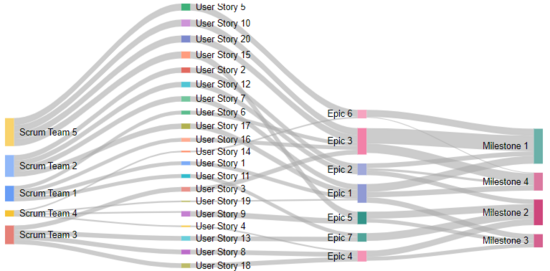
Using sankey diagram to map what resources (people/teams) are working in which user stories, how those user stories go into an Epic and how the epic is directed into a Milestone for the portfolio. If that complete link is not done that the resource should not be conducting the action.
Programing
References
- ↑ "[1]", Kennedy, A. B. W.; Sankey, H. R. (1898). The Thermal Efficiency of Steam Engines. 12 February 2022
- ↑ "[2]", Kennedy, A. B. W.; Sankey, H. R. (1898). The Thermal Efficiency of Steam Engines. 12 February 2022
- ↑ "[3]", Dave P. (2020). 4 use-cases for Sankey Charts. 13 February 2022.
- ↑ "[4]", Rehkopf, M. (2022). Stories, epics, and initiatives. 20 February 2022
- ↑ "[5]", Indeed Editorial Team. (2021). A Guide to Scrum Teams. 20 February 2022
- ↑ "[6]", Google Charts. Sankey Diagram. 20 February 2022

