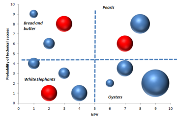
Bubble diagram as visual tool
Contents |
Abstract
The bubble diagram is a graphing technique used in project portfolio management to making decision, especially to display balance in new product project portfolios. These visual representation is an adaptation of the four quadrant BCG (star; cash cow; dog; wildcat) diagrams developed in 1970 by Bruce D. Handerson as strategy models [1]. The diagram is a variant of the regular x-y plot, where circle or ellipse are used instead the single points, and extra information are provided by varying the shape, the size and the colour. Furthermore the chart can usually be divided in four section to facilitate recognition of different situations. The most popular chart is the risk-reward which shows the probability of success on the vertical axis and the NPV ( Net Present Value) over a period of time on the horizontal axis.[2] The risk-reward portfolio mapping involves keeping the projects into four different categories:
- Pearls: high probability of success and generate high payoffs
- Oysters: long shots, but with high payoffs
- Bread & Butter: low-risk projects with low rewards
- White Elephants: low probability and low payoff projects
However it is possible to plot other different parameters on these bubble diagrams in order to seek balance:
- Ease vs attractiveness
- Strength vs attractiveness
- Cost vs timing
- Strategic vs benefit
- Cost vs benefit
This method is widely used by the companies even if just a small percentage use it as the dominant. This article aspirates to perform an overview of the bubble diagram method and its uses through some practical example and a comparison with different tools as the financial methods, strategic methods and scoring model. [3] Furthermore will be analyzed the advantages and the disadvantages of this method and will be discussed if actually can give a real help to the decision making in Portfolio Management.
Introduction to visual tools and portfolio management
Traditional project management is a process whereby each project is approved and managed independently focusing on the triple constraint (scope, time, cost) of the single project separate from other projects. [4] By contrast Portfolio management is a dynamic decision process, whereby a business’s list of active new product (and development) projects is constantly updated and revised. In this process, new projects are evaluated, selected and prioritized; existing projects may be accelerated, killed or de-prioritized; and resources are allocated and reallocated to active projects. The emphasis of portfolio management is on ensuring that each project contributes to the overall organizational success.[5]
To achieve this success, many different tools and methods are used. Below the main goals setted by using portfolio management are listed and the importance of the bubble charts to reach one of them is highlighted :
- Maximize the value of the portfolio for a given resource expenditure,
- Maintain the competitive position of the business
- Balance choosing the right mix of projects. For this point, the use of bubble diagram and other visual tools is important in order to reach the best results,.
- Achieving a strategically aligned portfolio
- Achieving the right number of projects for the limited resources available
Bubble diagram
Bubble charts are useful graphs for comparing the relationships between data objects in more than 2 numeric-data dimensions: the X-axis data, the Y-axis data, and the other datas represented by the bubble size, color and shape. In project portfolio, using the bubble charts can be a great help in making insightful business investment decisions. In order to avoid misleading charts, is important to understand the relationship between the bubble size and the data represented by the size. In the common case of circular bubbles, if the data is proportional to the radius, the data will be altered since the bubble area grows exponentially as the square of the radius (Failed to parse (unknown error): Area=π*r^2 ). For a better representation of the data, bubble data should be represented directly by the area using the circumference of the circle, in this case the bubble grows linearly in relationship to the diameter (Failed to parse (unknown error): circumference=π*diameter ). However, sometimes if one wants to exaggerate the differences or a more easily contrast between two projects, could be useful represent the data proportional to the radius. [7] In portfolio management projects , visual charting techniques , as bubble diagram, are employed in order to display balance in new product project portfolios. The most widely used and highly popular bubble diagram in portfolio management is the one that displays project risk (probability of success) on y axis and reward on X axis.
References
- ↑ B.D. Handerson, The Experience Curve - Reviewed IV. The Growth Share Matrix or The Product Portfolio.
- ↑ R.G. Cooper, S.J. Edgett, E.J. Kleinschmidt, R&D Portfolio Management Best Practices Study, Industrial Research Institute (IRI), Washington, DC., 1997.
- ↑ R.G. Cooper, S.J. Edgett, E.J. Kleinschmidt, Best practices for managing R&D portfolios, 1998.
- ↑ Project Portfolio Management Tools and Techniques Di Parviz F. Rad,Ginger Levin 10-13
