Risk-Reward Bubble Diagrams in Project Portfolio Prioritization
Developed by Stefan Borch Bilfeldt
Risk-Reward Bubble Diagrams are visual tools for achieving an overview of the different parameters of the project such as the added value of the project when selecting which projects to run. Hence, the Risk-Reward Bubble Diagrams are considered useful for portfolio structuring.
In the classical Risk-Reward Bubble Diagram, as suggested by Stage-Gate International among others [1] [2], a chart is made with a measure of the Project Importance (e.g. Net Present Value, NPV) on one axis and a measure of the Ease of Project Completion on the other. Four squares, or quadrants, are now formed within the graph determining the desirability of each project. Projects in the quadrant yielding high value and high ease of completion are named “Pearls”, and are the most desirable whereas “White Elephants” projects with low value and low ease of completion are the least desirable. In between are the “Bread & Butter” projects with high ease but low value and the oysters that add high value but with little ease of completion.
On this graph, the projects are displayed as surfaces, where the size, shape, colour etc. may indicate the costs of the project, the uncertainty of the estimates, the strategic fit or other relevant parameters.
The Risk-Reward Bubble Diagram has been altered several times to match the different needs of different companies or project organisations with the more famous adjustments being the ones of Procter & Gamble and 3M.
In this article the use of classical Risk-Reward Bubble Diagrams and their altered alternatives in portfolio prioritization will be investigated with focus on their benefits and limits. The Bubble Diagrams will be put in perspective to the BCG Portfolio Prioritization Matrix, as these are typically grouped together, though their differences and commons are still discussed in the literature.
Contents |
History
As with many other methods of this kind, tracing the Risk-Reward Bubble Diagram down to one “inventor” on a given day is practically impossible. The Bubble Diagram, however, is widely mentioned in literature from various authors [3] [4] [2] and is included in the PMI Standard for Portfolio Management under the name “Bubble Chart”. [5] In the Portfolio Management Standard, the Bubble Diagram (Bubble Chart) is denoted as a graphical representation “often used by organizations to balance and monitor their portfolios” [5]. The content parameters used in a generic Bubble Diagram, however, may be any measure of any property of the project.
The Risk-Reward Bubble Diagram, defining the displayed project properties in the Bubble Diagram, is mentioned by several authors, most notably Robert Cooper from Stage-Gate Inc. The Bubble Diagram is here considered “… an adaptation of the four quadrant BCG (star; cash cow; dog; wildcat) diagrams which have seen service since the 1970s as strategy models…” [1].
Background for Project Scoring
The Bubble Diagrams, however, are generally considered a visual representation of the project scoring results. Hence, the parameters shown in the Bubble Diagrams are quantifications of various project parameters found through the project scoring process. Several properties can be quantified, but some of the most notable and used [4] are:
- Risk: Risk numbers on different scales or risk costs (probability of a risk occurring times its expected economic impact) or different measures for assessing the risk.
- Value: Often expressed as Net Present Value (NPV), Expected Commercial Value (ECV) or the more vaguely (or multiply) defined Return On Investment (ROI).
- Time: for instance, Time to Complete or Time to Market
- Strategic Fit: Measure of fit with either business/corporate strategy or the strategy of a business unit
- Probability of Success: Either from a technical, commercial or combined point of view.
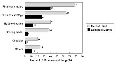
The Bubble Diagrams, therefore, presents a number of project scoring parameters in a single plot with each Bubble Diagrams being able to display up to 6 parameters at once using sizes, shapes, surfaces, colours etc. of the bubbles. According to Cooper [1], Risk-Reward Bubble Diagram is with 44 % the most used Bubble Diagram. The Risk-Reward Bubble Diagram is used in 41 % of businesses but is only the dominant method in 13 % of the businesses, as shown in Figure 1 presented by Cooper [3].
Application and Use
The Risk-Reward Bubble Diagram is defined as a variant of the Risk/Return Chart, where “… one axis is some measure of the reward to the company and the other is a success probability ”. [3] The primary intended use is to create an overview of the projects or programmes in a portfolio for reviewing and controlling a portfolio in regards to which projects are in the portfolio. This can be done either at a corporate level, for a business unit, on a department level or on any level throughout the organisation.
Two fundamental variants are mentioned in [3], where one is based on the qualitative approach of assessing the reward on a worded scale (poor, moderate, excellent) and having a measure of success that include both the commercial and technical success. With this method, several aspects of the reward, such as market lead benefits, branding effects etc. for the company can be taken into account rather than solely the financial reward. Hence, the commercial success needs to be taken into account on the other axis to account for the financial aspect. This method has the advantage of a more nuanced view upon the project including strategic or long-perspective elements but may lead to lack of transparency in the scoring as well as an uneven basis for comparison between the different projects in the diagram.
Another approach is the strictly quantitative way, where the reward in a financial measure (NPV/ECV/ROI) is presented on one axis. Since this then is considered to account for the financial probability of success, the secondary axis displays only a measure of the technical probability of success. The advantage in this is the even base for comparison between the different products and a uniform way of rating them. On the other hand, important aspects of the rewards or risks may be left out.
Risk-Reward Bubble Diagram Structure
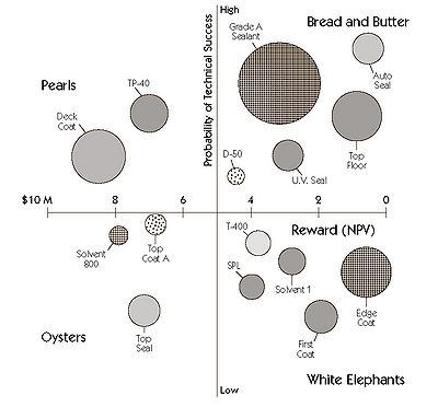
An example of the Risk-Reward Bubble Diagram for a business unit of a large medical company is shown in Figure 2. In this figure, the NPV of each project alongside the probability of technical success is shown, and the circle size indicates the project costs. The shadings indicate the product line.
The costs of each project is either estimated based on the project proposal in case of a new project not yet commenced or the revised budget in case of a running project, when for instance using Risk-Reward Bubble Diagrams with a go/kill-approach [3].
On the Risk-Reward Bubble Diagram, four quadrants are shown. Projects in these four quadrants will be grouped in the four groups: Pearls, Oysters, Bread-and-Butter and White Elephants.
- Pearls (upper left quadrant): These are the projects who have a high probability of success (regardless of the measure) and bring high value to the company. These projects are highly desirable and are in most cases projects that should be part of the portfolio. In cases of extensive resource use or strategic misfits, the question of whether these projects should run or not may be risen.
- Oysters (lower left quadrant): The Oysters are the projects who have a high risk of being unsuccessful but with a high reward if successful. These projects may be vaguely defined or highly innovative projects depending on a successful technological development. Some of these projects should be included in the portfolio but with a higher caution than the pearls. One might in this case consider the time frame, the costs of running the project, as well as strategic importance as additional parameters for selecting the projects from this category.
- Bread-and-Butter (upper right quadrant): These projects do not pose any larger risk in regards to the technological probability of completion. Yet, they do not serve as any notable reward for the company and are usually rather simple projects including for instance upgrades and minor fixes of existing systems.
- White Elephants (lower right quadrant): Low-reward projects with a low probability of success are called White Elephants. These projects are the not-wanted projects that exist in almost every company. Projects like these should, as one can imagine, usually get killed off, unless they serve as a highly important strategic purpose. Usually, however, this would lead to some kind of reward.
In the example shown in Figure 2, around 50 % of the spending is found in the Bread-and-Butter projects and around 25 % of the spending is in the White Elephants-projects, that contain around one third of the projects in the portfolio. This should lead to a review of the portfolio and its content, as suggested by [2].
The Risk-Reward Bubble Diagram presented in Figure 2 can also be used as a check for resource management. In almost every organisation, there is a limited amount of accessible resources meaning that these should preferably be distributed on the Pearls and Oysters/Bread-and-Butter projects. When a potential product is evaluated for inclusion in the portfolio, the total amount of resources should, of course, not increase. Hence another project may need to be killed off, for which the Risk-Reward Bubble Diagram will give a good overview of potential project candidates.
Variants of the classical Risk-Reward Bubble Diagram
As mentioned, several project scores can be shown in the Risk-Reward Bubble Diagram, such as the costs of the project and the product line shown in Figure 2. This opens up for several possible variants and adjustments to the purpose of the specific users of a given Risk-Reward Bubble Diagram. In [3], it is suggested that not yet approved projects under consideration are illustrated as a dotted circle alongside the running projects. In addition to this Bubble Diagram, an additional Risk-Reward Bubble Diagram showing projects on hold and those awaiting free resources is suggested.
Although every company/business unit are free to alter the Risk-Reward Bubble Diagram to their specific needs, especially two companies are rather well-known for their adaptations of the classical Risk-Reward Bubble Diagram, as shown by example in 2; 3M and Procter & Gamble. [3]
3M’s Elliptical Bubble Diagram
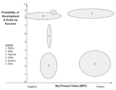
The Bubble Diagrams mentioned here build upon the principle of project scoring, requiring a point estimate of the project properties. Regardless of, whether the project is assessed based on the Project Proposal (as suggested by, amongst other, Eric Schott [6]) or from other qualitative or quantitative measures, an uncertainty in the estimate will in general always exist. These are not necessarily addressed in the classical Risk-Reward Bubble Diagram, leading some business units within 3M to alter the Bubble Diagram to display the estimate uncertainty. An example of the 3M Risk-Reward Bubble Diagram is shown in Figure 3.
The most notable difference to the classical Risk-Reward Bubble Diagram, shown in Figure 3, is the elliptical bubbles. These ellipses indicate the uncertainty on each of the axis parameters. The shape of the bubbles, thus, indicate the uncertainty, also denoted fuzziness, of the projects. This means, for instance, that a tall, slim bubble has little uncertainty in the probable NPV estimate (shown on the x-axis) but a given uncertainty in the Technical Success Probability estimate. Hence, the smaller the bubble, the higher the certainty of the estimates.
Procter & Gamble’s 3D Bubble Diagram
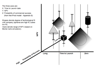
Procter & Gamble developed the elliptical Risk-Reward Bubble Diagram of 3M, showing the estimate uncertainties, further by adding Time to Launch as an additional axis. This 3D Diagram is created using CAD-tools and therefore loses some of its value when projected down into 2D, as it is shown in Figure 4.
There are four possible shapes in Bubble Diagram [3] each denoting the fit with the company strengths with spheres being best fit and cubes being the worst fit. Furthermore, the ROI of each project can be displayed, as well as colour indications of the projects’ stages in the Stage-Gate model and comet-tail time tracking of the projects.
The uncertainty for each measure is estimated through a “high”, “low” and “realistic” estimate, from which a probability curve based on this data is generated. [1] The probability curves are afterwards fed into the computer-based Monte Carlo-tool, generating a number of scenarios and thereby creating the points for the sphere presented in the Bubble Diagram. The estimated NPV can be found from these simulations, with Procter & Gamble displaying the full range of NPVs as the uncertainty (or I-) bars. The Procter & Gamble 3D Risk-Reward Bubble Diagram is considered the most sophisticated Risk-Reward Bubble Diagram. [3]
Limitations and other methods
The Risk-Reward Bubble Diagrams are, as mentioned, the most commonly used Bubble Diagrams within Portfolio prioritization. As presented in [3], 41 % of the businesses uses Bubble Diagrams (of any kind) as a portfolio management method with 13 % using it as a dominant method. It thereby scores below elements such as “financial method” and “business strategy”, which 77 % and 65 %, respectively, of businesses use and 40 % and 27 % consider their dominant method. Nonetheless, a substantial number of businesses uses the Bubble Diagrams and thus Risk-Reward Bubble Diagrams in their portfolio management.
Limitations in use
One of the characteristics of the Risk-Reward Bubble Diagrams is that there is no explicit method for interpreting these and build up a portfolio around a Risk-Reward Bubble Diagram. It is therefore a tool giving the portfolio management an overview of certain properties of many projects at once and from that point decide on which projects to run. This requires a portfolio management who can aim at the right number of Oysters and Bread-and-Butter projects within their resource capabilities and requirements in their organisation.
With Bubble Diagrams and even Risk-Reward Bubble Diagrams being able to show a wide range of properties, the art when using them is to select the right project parameters. This imposes quite a risk of the management looking at the wrong project variables when making portfolio prioritization decisions or that the Bubble Diagram simply becomes to information heavy and complex to interpret. [4]
Furthermore, when using qualitative and/or quantitative measures, it is of importance to make a common reference level for the projects, so that these are directly comparable in the Bubble Diagram. Presenting projects that are scored based on different criteria or using different models within one Bubble Diagram will reduce the comparability of the projects without one necessarily being able to see this from the diagram. Additionally, when using a strategic project management differentiation between “must” and “could” projects [6], this must be kept in mind when making or looking at the Risk-Reward Bubble Diagrams, as strategically important projects may be killed based on low scores in NPV/Probability of Success.
Many people have related the Bubble Diagrams to the traditional BCG Growth-Share Matrix from the 1970’s, separating projects into stars, cash cows, question marks and dogs or even stated that these two methods were the same. In a direct comparison of the two diagrams, the Pearls from the Risk-Reward Bubble Diagram correspond to Stars, the Oysters correspond to the Question Marks, the Bread-and-Butter to the cash cows and the White Elephants to the Dogs. [7] There are, however, several differences. [4] First of all, the axes in the Growth-Share Matrix are given as market attractiveness versus competitive position, whereas several options and additional dimensions or displays of project properties can be included in the Risk-Reward Bubble Diagrams. In addition to this, the classical BCG Growth-Share Matrix focuses on the current-state analysis. The Bubble Diagram is highly based on the analysis of adding new projects into an existing portfolio and/or managing which projects are in the portfolio and is thus more future-oriented.
According to Cooper, who is considered a advocate in favour of the Risk-Reward Bubble Diagrams, the consideration of market attractiveness and business position can be apropriate for analysis of known businesses and markets. [1] For new product projects or likewise where the the market and/or the business' ability to operate within the market is not necessarily known, this scale may not be as apropriate. Therefore, the additional options given in the Risk-Reward Bubble Diagram, e.g. the different and additional axes possibilities, might make the use of a Risk-Reward Bubble Diagram preferable over the BCG-matrix for, amongst others, new product projects. Using a combination of these two, however, may be of benefit, as both a consideration of the market and the market position as a known as well as more unknown factors would be applied. Of course, the results when categorising the projects in the four quadrants would need a more careful consideration. If a project is placed in two different quadrants, i.e. a star in BCG-Matrix and an Oyster in the Risk-Reward Bubble Diagrams, a more careful consideration would be required. If the correspondances suggested by Basu [7] were to hold true, the differences would be minor but given the possibility of uncertainty within the market knowledge in the two models, larger differences may arise. Whereas the combination might provide synergy by uncovering a wider amount of project/portfolio considerations, it may introduce a certain amount of confusion, as one model simply can be more appropriate for the type of project/portfolio.
On an entire portfolio level, the implementation of both models may be too extensive and introduce to many risks. Using different models on different parts of the portfolio, however, may make more sense - especially if the portfolio is rather large or consists of many rather different projects. It is nonetheles important to notice that a direct comparison between the two models, as suggested by Basu [7], may be misleading as the preliminary assumptions are different between the models.
Annotated Bibliography and References
- ↑ 1.0 1.1 1.2 1.3 1.4 Cooper, Robert G., Edgett, Scott J., Kleinschmidt, Elko J., Portfolio Management: Fundamental for New Product Success, 2002: A working paper from Stage-Gate Inc., a project management consulting company founded by Robert G. Cooper and Scott J. Edgett. Robert G. Cooper is traditionally considered a strong advocate for, if not the inventor of, the Risk-Reward Bubble Diagrams. In the working paper, the Risk-Reward Bubble Diagram is presented as a method and the use of it as well as examples are presented. The company has publiced several books.
- ↑ 2.0 2.1 2.2 Levine, Harvey A., Project Portfolio Management: A Practical Guide to Selecting Projects, Managing Portfolios, and Maximizing Benefits, 2005: A book on project portfolio management written by PMI Fellow Harvey A. Levine, who has worked both as an author and a consultant within project management. The book is highly focused on the value-bringing to the organization and widely uses, acknowledges and explains the principle of the scoring approach and the different methods within this. The Risk-Reward Bubble Diagram is here presented as a tool in extension to the rather extensive project scoring and ranking principles. Likewise, the managing of portfolios based on the scoring data is taken into consideration
- ↑ 3.0 3.1 3.2 3.3 3.4 3.5 3.6 3.7 3.8 3.9 Cooper, Robert G., Edgett, Scott J., Kleinschmidt, Elko J., Portfolio Management for New Product Development: Results of an Industry Practices Study, 2001
- ↑ 4.0 4.1 4.2 4.3 Milosevic, Dragan Z., Project Management ToolBox: Tools and Techniques for the Practicing Project Manager 2003: A book on many practical tools for project and portfolio management by Dragan M. Milosevic. The book is widely focused on project management and the portfolio management is here in a wider degree looked upon from the view of project manager's responsibilies. When looking into the portfolio management, the requirements from each project and the collaboration between these are hence seen from a project management perspective. Thus, the scoring approach is not as extensively covered and the Risk-Reward Bubble Diagrams are presented in a more general fashion as a tool for viewing the projects and their benefits in a portfolio context.
- ↑ 5.0 5.1 Project Management Institute, THE STANDARD FOR PORTFOLIO MANAGEMENT, 2008
- ↑ 6.0 6.1 Schott, Eric, VL Strategisches Projektmanagement: Portfoliostrukturierung, 2015
- ↑ 7.0 7.1 7.2 Basu, Ron, Managing Projects in Research and Development, 2015


