Bubble diagram as visual tool
Contents |
Abstract
The bubble diagram is a graphing technique used in project portfolio management to making decision, especially to display balance in new product project portfolios. These visual representation is an adaptation of the four quadrant BCG (star; cash cow; dog; wildcat) diagrams developed in 1970 by Bruce D. Handerson as strategy models [1]. The diagram is a variant of the regular x-y plot, where circle or ellipse are used instead the single points, and extra information are provided by varying the shape, the size and the colour. Furthermore the chart can usually be divided in four section to facilitate recognition of different situations. The most popular chart is the risk-reward which shows the probability of success on the vertical axis and the NPV ( Net Present Value) over a period of time on the horizontal axis.[2] The risk-reward portfolio mapping involves keeping the projects into four different categories:
- Pearls: high probability of success and generate high payoffs
- Oysters: long shots, but with high payoffs
- Bread & Butter: low-risk projects with low rewards
- White Elephants: low probability and low payoff projects
However it is possible to plot other different parameters on these bubble diagrams in order to seek balance:
- Ease vs attractiveness
- Strength vs attractiveness
- Cost vs timing
- Strategic vs benefit
- Cost vs benefit
This method is widely used by the companies even if just a small percentage use it as the dominant. This article aspirates to perform an overview of the bubble diagram method and its uses through some practical example and a comparison with different tools as the financial methods, strategic methods and scoring model. [3] Furthermore will be analyzed the advantages and the disadvantages of this method and will be discussed if actually can give a real help to the decision making in Portfolio Management.
Introduction to visual tools and portfolio management
Traditional project management is a process whereby each project is approved and managed independently focusing on the triple constraint (scope, time, cost) of the single project separate from other projects. [4] By contrast Portfolio management is a dynamic decision process, whereby a business’s list of active new product (and development) projects is constantly updated and revised. In this process, new projects are evaluated, selected and prioritized; existing projects may be accelerated, killed or de-prioritized; and resources are allocated and reallocated to active projects. The emphasis of portfolio management is on ensuring that each project contributes to the overall organizational success.[5]
To achieve this success, many different tools and methods are used. Below the main goals setted by using portfolio management are listed and the importance of the bubble charts to reach one of them is highlighted :
- Maximize the value of the portfolio for a given resource expenditure,
- Maintain the competitive position of the business
- Balance choosing the right mix of projects. For this point, the use of bubble diagram and other visual tools is important in order to reach the best results,.
- Achieving a strategically aligned portfolio
- Achieving the right number of projects for the limited resources available
Bubble diagram

Bubble charts are useful graphs for comparing the relationships between data objects in more than 2 numeric-data dimensions: the X-axis data, the Y-axis data, and the other data represented by the bubble size, color and shape.
In project portfolio, using the bubble charts can be a great help in making insightful business investment decisions.
In order to avoid misleading charts, is important to understand the relationship between the bubble size and the data represented by the size. In the common case of circular bubbles, if the data is proportional to the radius, the data will be altered since the bubble area grows exponentially as the square of the radius (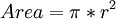 ). For a better representation of the data, bubble data should be represented directly by the area using the circumference of the circle, in this case the bubble grows linearly in relationship to the diameter (
 ).
However, sometimes if one wants to exaggerate the differences or a more easily contrast between two projects, could be useful represent the data proportional to the radius. [7]
In portfolio management projects , visual charting techniques , as bubble diagram, are employed in order to display balance in new product project portfolios.
The most widely used and highly popular bubble diagram in portfolio management is the one that displays project risk (probability of success) on y axis and reward on X axis.
).
However, sometimes if one wants to exaggerate the differences or a more easily contrast between two projects, could be useful represent the data proportional to the radius. [7]
In portfolio management projects , visual charting techniques , as bubble diagram, are employed in order to display balance in new product project portfolios.
The most widely used and highly popular bubble diagram in portfolio management is the one that displays project risk (probability of success) on y axis and reward on X axis.
The risk-reward portfolio mapping involves keeping the projects into various categories as per the quadrant they fall into. As mentioned before, each quadrant correspond to a different situation distinguished from the others by a particular name. Below a brief description for every quadrant is reported:
- Bread and Butter (upper left): These type of projects have high probability of success but low reward. They are are small, simple projects which include extensions, modifications, fixes and updating.
- White Elephants (bottom left). These are the projects with low probability and low reward. Every business wants to avoid them, but inevitably there are always few and they are difficult to kill. In this case there are too many of them.
- Pearls (upper right quadrant): Most businesses aspire more of these. These are the potential star products, projects with a high probability of technical success, and which are also expected to give a very high reward. There are two Pearl projects, and one of them has been allocated considerable resources (denoted by the sizes of the circles).
- Oysters (bottom left): These are the long-shot projects, where high reward is expected, but as the same time also a low probability of technical success. These are the projects where technical innovations will open the way for solid payoffs. [8]
An example of bubble diagram is shown in Figure 1 where the size of each bubble shows the annual resources spent on each project (Euros per year or people or work-months allocated to the project) and the color shows the timing : The red color is for projects with imminent lunch, while the blue colors represents an early stage project.
Analyzing this example, is possible to notice the high number of White Elephants that should be reduced, but on the other hand there are good investments for Oysters resources that means possible innovations in the future. The lack of Pearls is easily visible and at the same time there is a balanced number of Bread and Butter. Is important to don’t have big bubbles in Bread and Butter which means much money and resources spent for low value projects.
A relevant feature of this chart is that forces management to consider the resources implications and deal with it as well as the timing. Given finite resources (e.g., a limited number of people or money), the sum of the areas of the circles must be a constant. That means , if you add one project to the diagram, you must subtract another; alternatively you can shrink the size of several circles.
Thus, this apparently simple risk/reward diagram shows a lot more than simply risk and reward data: it also shows resource allocation, timing and the balance between the projects.
Besides the most common risk – rewards chart, many other parameters could be used with the bubble charts in order to provide different information. Below the table show the most popular parameters used in the bubble charts:
| Chart Type | Y-Axis | X-Axis | % |
| Risk vs. Reward | Probability of Succes | NPV, Total benefit after years of launch | 44,4 |
| Newness | Market newness | Technical newness | 11,1 |
| Ease Vs. Attractiveness | Market attractiveness (growth, potential consumer appeal, life cycle) | Technical feasibility | 11,1 |
| Strengths Vs. Attractiveness | Market attractiveness (growth, potential consumer appeal, life cycle) | Competitive position | 11,1 |
| Cost Vs. timing | Time to impact | Cost to implement | 9,7 |
| Strategic Vs. Benefit | Business intent, NPV, attractiveness | Strategic focus or fit | 8,9 |
| Cost Vs. benefit | Cumulative development costs | Cumulative Reward | 5,6 |
Variant of Bubble chart

Exist also some variants of the bubble diagram, one of them is used to effectively describe uncertain estimates. For each project there are optimistic and pessimistic estimates taking in count uncertain variables, leading to a range of values both for NPV and probability of technical success. In this case as shown in Fig.2 , the size and the shape of the bubble present the uncertainty of projects: very small bubbles mean highly sure estimates on each dimension, instead large ellipses mean high uncertainty (a big range between worst case and best case) for that project. [9]
Strength and weakness
The BC cannot be made before all the data have been collected and processed. Very few or no studies can be found in the literature regarding the exact effect of the chart in use. It is therefore impossible to generalize and conclude generically whether the BC is worth implementing in a company. In order to get an overview a list of benefits and disadvantages is conducted. This list can be used to understand in which situation BCs would be easy to implement and use, and in which situation the implementation of such a chart can be a costly and non-benefiting project.
Strengths
- Efficient when many different processes are running at the same time
It’s a really useful tool to have a fast overview for decision making, especially when you have to take in consideration many different projects at the same time. Give the possibility to compare many similar projects in a short time and get fast conclusions. As mentioned before, in this way the bubble chart represent a good tool for reach the balance choosing the right mix of projects.
- Easy to use
Really easy to implement in many different project situation There is no need of any specialist to make it and to read it neither Is possible to make it in short time
- Easy to learn
Since this visual tool is basic and simple, the employees can learn how to use it in a fast way and without needing any special crash course. Furthermore this means that means not expenses to implement it.
- Easy to update, modify and maintain
Since is a visual chart, it’s fast and low cost to maintain and update due to the changing of data
References
- ↑ B.D. Handerson, The Experience Curve - Reviewed IV. The Growth Share Matrix or The Product Portfolio.
- ↑ R.G. Cooper, S.J. Edgett, E.J. Kleinschmidt, R&D Portfolio Management Best Practices Study, Industrial Research Institute (IRI), Washington, DC., 1997.
- ↑ R.G. Cooper, S.J. Edgett, E.J. Kleinschmidt, Best practices for managing R&D portfolios, 1998.
- ↑ Project Portfolio Management Tools and Techniques Di Parviz F. Rad,Ginger Levin 10-13