Sankey Diagram
(→Quick trick to replace Machine-learning) |
(→Conclusion) |
||
| (2 intermediate revisions by one user not shown) | |||
| Line 52: | Line 52: | ||
== Analyzing Hierarchy type data <ref name="Dave" /> == | == Analyzing Hierarchy type data <ref name="Dave" /> == | ||
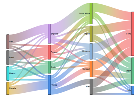
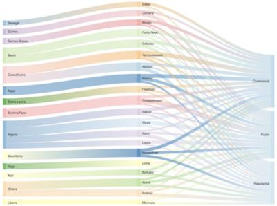
| − | [[File:Sankey5.png|400px|thumb|right|Hierarchy Sankey Diagram <ref name="Dave" />]] In Dave's article, he describes the Hierarchy Sankey diagram as a flow diagram that follows hierarchy type data. What this means is that the data must follow a specific order and it must not mix one type with the other at the same level in the diagram. For example, in his article, Dave explains that he is provided with a dataset on African mobile distribution. This dataset provides the country, city, region, segment, sales, and profits. The data is classified as hierarchical and it must follow the order of the country first, then the city, and finally the segment. This hierarchy formulation makes it easier to compare data between its equals. In the example diagram, it is clear that Nigeria is the country with the most mobile users while Liberia is the country with the least mobile users. At a city level, it can be concluded that all the African cities have a quite different distribution when splitting into the three segments, but there is a clear preference for one of the segments over the others. While at the segment level there is not much overall difference between the three options. What can be taken from the diagram is that each mobile segment can identify what parts of the African continent require their services and invest more heavily in the infrastructure to expand their market. | + | [[File:Sankey5.png|400px|thumb|right|Hierarchy Sankey Diagram <ref name="Dave" />]] In Dave's article, he describes the Hierarchy Sankey diagram as a flow diagram that follows hierarchy type data. What this means is that the data must follow a specific order and it must not mix one type with the other at the same level in the diagram. For example, in his article, Dave explains that he is provided with a dataset on African mobile distribution. This dataset provides the country, city, region, segment, sales, and profits. The data is classified as hierarchical and it must follow the order of the country first, then the city, and finally the segment. This hierarchy formulation makes it easier to compare data between its equals. In the example diagram, it is clear that Nigeria is the country with the most mobile users while Liberia is the country with the least mobile users. At a city level, it can be concluded that all the African cities have a quite different distribution when splitting into the three segments, but there is a clear preference for one of the segments over the others. While at the segment level there is not much overall difference between the three options. What can be taken from the diagram is that each mobile segment can identify what parts of the African continent require their services and invest more heavily in the infrastructure to expand their market. In terms of the Sankey Diagram application, it can be concluded that in most cases Sankey Diagrams will follow and visualize hierarchical data. This is as processes tend to follow a structured flow and dependencies are specified between actions, data must enter and exit in a specific place. |
== Quick trick to replace Machine-learning <ref name="Dave" /> == | == Quick trick to replace Machine-learning <ref name="Dave" /> == | ||
| − | [[File:Sankey6.png| | + | [[File:Sankey6.png|510px|thumb|left|Machine-learning Sankey Diagram <ref name="Dave" />]] In his article Dave makes a bold statement that Sankey diagrams are able to replace Machine learning to a certain degree. Machine learning at its core is used to analyze multiple inputs and outputs and identify patterns from the data. |
| Line 109: | Line 109: | ||
The diagram is versatile and can be applied to different scenarios to visualize completely distinct insights. However, the versatility of the diagram does have limitations when it comes to the traceability of the process. If a specific iteration needs to be studied to understand its causes, the diagram does a poor job at tracing. As information is generalized in the flows, an individual data point cannot be identified directly on the diagram. To obtain a trace of resource involvement the dataset used to create the diagram would have to be picked apart to find the path taken from origin point to endpoint. | The diagram is versatile and can be applied to different scenarios to visualize completely distinct insights. However, the versatility of the diagram does have limitations when it comes to the traceability of the process. If a specific iteration needs to be studied to understand its causes, the diagram does a poor job at tracing. As information is generalized in the flows, an individual data point cannot be identified directly on the diagram. To obtain a trace of resource involvement the dataset used to create the diagram would have to be picked apart to find the path taken from origin point to endpoint. | ||
| + | |||
| + | Even though the diagram was created in 1898, it has recently gathered attention in the last decade. This has led to the development of new applications adapted to the study line it is applied to. The application that has picked my interest is that in risk management, this application has the potential to create benefits and savings for project/program/portfolio managers. In many cases, managers must take an either-or decision, a risk Sankey diagram could help them make the decision by prioritizing the action that could have the most negative direct/indirect impact on the project. This application does require a more extensive study of risk as the direct and indirect impacts have to be identified/studied to deliver the benefits of the risk Sankey diagram insight. It could be argued that the time spent developing this data could be more costly than the effects of the indirect impacts a traditional Risk management assessment would ignore, and therefore it is important to assess the level of uncertainty a project has to determine if superficial risk management or if a more extensive application is needed. | ||
= Annotated Bibliography = | = Annotated Bibliography = | ||
Latest revision as of 11:04, 22 March 2022
By Sonia Guerra Loji (s203379)
The article's aim is to highlight the usefulness of the Sankey diagram in a project & portfolio management context. The article includes a discussion of the diagram's pros and cons from the Managements perspective.
Contents |
[edit] Abstract
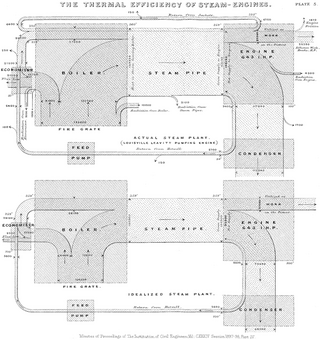
Beginning in 1898, the Sankey diagram was first used by an Irish captain named Matthew Henry Phineas Riall Sankey. This first implementation of the diagram showed the energy efficiency of a steam engine. [2] Nowadays there are four main implementations of the Sankey diagram. First, to analyze flow, flow being whatever has movement (like resources) in the scope defined by the diagram. Second, to analyze time-based patterns, this type can visualize the behavioral change of a specific persona, group, thing, over a specific time-lapse. Third, to analyze hierarchy type data, this is used when there are connected relations between the data but a hierarchy between the data has been defined. This hierarchy defines the order in which the data will be split and mapped in the diagram. And finally, the "quick trick" to replace Machine-learning, the Sankey diagram can be used to find and understand patterns in the data instead of using machine learning. [4] All four applications of the Sankey diagram can produce valuable insights to data in a visual and straightforward way to understand.
Correct application and automation of the Sankey diagram can provide fast and easy access to complicated data. The purpose of the article is to dive further into the possible applications and key characteristics of the Sankey diagram, as well as the benefits and limitations it can bring to upper management when making decisions in terms of resources and strategy.
[edit] Elements of the diagram
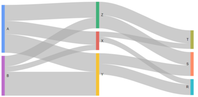
The Sankey Diagram is made up of five essential parts; this is flow, nodes, origin points, endpoints, and widths of the flow. As seen in the example diagram to the left, the nodes are identified by colored lines and letters. The nodes represent the activities, projects, people, etc. that are part of the visualized system. The flow of resources is visualized in the diagram by gray waves that connect the nodes, these gray waves widths represent the number of resources being passed from one node to another as well as the path the resources take through the system. This means that if the width of the gray wave is thin, few resources are being passed on to the next node. While if the gray wave is thick, a substantial number of resources are being passed on to the next node.
As mentioned previously the resources can be anything from money, human labor, materials, etc. The system as a whole can represent the flow of a process like a steam engine to the circulation of a global economy. For this reason, it is important to identify the origin points (where the system begins) and the endpoints (where the system ends). In the case of the example diagram, the origin points are nodes A and B, while the endpoints are nodes R, S, and T. In general terms the system flow should be read from left to right, and therefore when mapping the system's nodes the origin points should be towards the left extreme and the endpoints towards the right extreme. The Sankey Diagram can also show the equality or inequality between the inputs and outputs of the nodes. In the example diagram, it can be seen that node Z receives and gives the same flow, but nodes X and Y have a higher input than output. These visualizations of types of inequalities can help decision-makers notice areas of improvement faster. Depending on the program and style used to create the visualization, features like the color of the flow waves can be changed to resemble the color of the node it is originating from. Other more advanced features can be added to the code to create a more self-explanatory diagram, for the purpose of this article only the basic features are mentioned.
Another feature that is important to include in a Sankey Diagram is the system boundaries. The system boundaries represents the limitation of the process under study and can take a focus on spatial or temporal [5]. A spatial system boundary is when the limitation is based on a space or region, this can be a physical space or a figurative space. For example, when a project manager identifies the area in which the intervention or study will be focused on in a physical plain that could be limiting its study to a 2 floor of a building under construction. A temporal system boundary is when the limitation is based on a period or state. In a temporal system boundary option, the project manager is looking at a specific period in time. For example, a project manager could be interested in analyzing the energy consumption of the construction crew for the next 2 months to assess where energy can be conserved and make changes for the rest of the project. The system boundary can also be considered the scope of the process under study.
[edit] Types of Application
According to medical literature, there are three broad categories of use for Sankey [6]:
- to visualize flow/transitions over time
- to visualize flow/transitions to specific events
- to demonstrate associations.
Writer Pranay Dave has stated there are four main use-cases for a Sankey diagram [4] which can be categorized in one of the three categories. Depending on the use-case, the diagram can visualize simple flows as well as aid in advanced analytics. Dave's main observation of the Sankey diagram is that it can be a powerful visualization tool if and only if it is used in the correct context and purpose.
His reasoning for this is that a visualization tool used incorrectly can serve little purpose and provide little to no insight to the user. An example he uses in his article to explain the incorrect use of diagrams is that of using a bar chart to visualize sales trends. Even though the bar chart can provide insight, a trend line chart could more effectively represent the changes in sales trends over the years. Under this logic, Dave has defined four use-cases in which it makes sense to use a Sankey Diagram.
[edit] Analyzing Flow [4]

In a project/program/portfolio scenario such as a construction project, project managers need to be aware of how much product is being used and wasted in each activity. For example, in some construction firms, cement mixing is done directly on the ground while others invest in concrete mixers with a revolving drum. Calculating which method is more efficient in time and which creates the least amount of waste can make a significant difference to the overall budget of the project when quantities of a product are heavily used. The Sankey diagram can also visually represent the amount of waste created throughout the entire process by adding to the waste at each step of the way and summing it at the end of the process.
[edit] Analyzing Time-Based patterns [4]
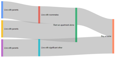
Sankey diagrams can also be used to identify time-based patterns. Author Dave describes this approach as understanding the customer's journey through time. In this example, the Sankey diagram represents a person's living quarters choices. Depending on the life path the individual is in, he/she can choose to move out of their parent's home to live with a roommate, a significant other, or alone. As life progresses the individual sharing his living quarters can decide to rent or buy his own place.
Companies typically create personas to identify who their potential clients are and what their needs and wants are. In many cases, the studies go as deep as to simulate the personas' decision-making pattern. The Sankey diagram in a time-based perspective can visually show the pattern trail personas typically take. This creates a roadmap for companies to target people that fit into the persona identity with products depending on the stage of the pattern trail they are at that moment. For example, someone that has just moved out of their parent's home doesn't have a lot of money to spend on furniture, so IKEA starts targeting that person with their affordable and stylish furniture. In comparison with someone that has been living on their own for a while and has greater purchasing power, they would like to invest in something more permanent. In that case, a company like Jacobsen could target this potential buyer as this person is now at a stage where this would be considered a reasonable purchase as opposed to when they first moved out of their parent's home.
In terms of a project application, managers can apply a Time-based Sankey Diagram to predict how their team is doing based on previous project experiences. Understanding the behavioral patterns of those in the project team can allow the manager to predict and prevent scope creep and/or project failure. By analyzing previous projects' End of Project Reports managers can identify the best practices and retrospectives, with this they can plan by identifying patterns and visually mapping likely routes of project progression according to the team's behavior and decision making.
[edit] Analyzing Hierarchy type data [4]
[edit] Quick trick to replace Machine-learning [4]
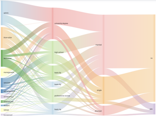
The idea that the Sankey diagram can represent a visual embodiment of the machine learning analysis is not so crazy when the data is not too extensive. In Dave's example, a bank has gathered information about the individuals they send marketing campaigns to. The point of the analysis is to identify which type of individuals are more likely to respond to marketing and who are less likely. The analysis involved the individual's occupation, level of education, marital status, and whether they responded to the marketing campaign or not.
Even though Dave creates an interesting point of discussion by proposing to replace machine learning with a simpler Sankey diagram, I would have to disagree with him to an extent. It is true that the diagram can visualize the flow between the different customer attributes and analyze that most customers do not respond to the marketing. But there is one big flaw when using a Sankey diagram instead of machine learning, that is that we cannot trace back from those that did respond to the marketing to which were the attributes that contributed to this answer. One of the major flaws of the Sankey diagram is that there is no way of tracing back your steps from the endpoint to the origin point. This is because the diagram is made in such a way that the number of resources that are input into a node are then redistributed when inputting them into another node.
For example, in the image, it is shown that most of those that responded to the marketing campaign are married. But out of those that we know that are married how many had university degrees, high school degrees, or basic education? The answer is inconclusive, as the diagram cannot clearly define where those married individuals came from. In conclusion, if the bank wanted to analyze the data to identify which type of people responded better to their marketing campaign this approach is not optimal and they would be better with using machine learning. But if their goal is to only visualize the general consensus of who and who many were targeted and responded to then the Sankey diagram is a clever way to understand your data.
[edit] Risk Management
Another application for the Sankey Diagram could be applied in a risk management approach for a project/program/portfolio. The diagram can allow stakeholders to explore and have an overview of "linkages across sectors and hypothesize about how changes in one sector may affect another"[7]. Other applications of visual risk management like the Risk Management Matrix identify the possible risks in a project/program/portfolio internal & external environment. This matrix helps stakeholders identify risks and create action plans to mitigate the effects it creates. But this visualization does not identify how and where the risk has its effect, the impact on one area of the project can have a significant impact overflow to other areas of the project due to the dependencies that exist between activities or resources.
To create a Risk Management Sankey diagram, it is important that the Risk Management Matrix is done first. The matrix should assess the level of risk/impact, probability of it happening, and which activity is impacted directly and indirectly. Once this information is gathered, the Sankey diagram can be created. The origin points would be the potential risks, the nodes would be the activities that are being impacted by the risks, the flow would be the level/percent of impact the risk creates to the activity, and the endpoints could be the predicted outcome of the project. The outcomes could be classified as continuing as planned, at risk, a major risk, or the project has failed. This analysis of potential outcomes should be done with the Risk Management Matrix. In addition, the flows transferred between nodes would be the indirect impact of risks trickled down to the rest of the project/program/portfolio. This application of the Sankey Diagram can serve as a warning sign for stakeholders when problems are found to prioritize accordingly knowing what the direct and indirect impacts are, as well as what the predicted outcome is if the problem is not mitigated in time.
[edit] Example in Portfolio Management at Maersk's Technology Portfolio
The main purpose of the Sankey Diagram is to visualize the flow of resources quickly and easily. This section will focus on how a Sankey Diagram can be useful in a Portfolio management case. First, there is a need to define some basic terminology used in a Technology Portfolio as this example is based on one.
Many companies have transitioned from a traditional Waterfall methodology where actions are dependent on other actions to an Agile methodology where actions can be done in parallel, the Agile methodology has introduced new terminology like Epics and User Stories [8]:
- Stories, "also called "User Stories," are short requirements or requests written from the perspective of an end-user."
- Epics, "are large bodies of work that can be broken down into a number of smaller tasks (called stories)."
- Milestones, "are collections of epics that drive toward a common goal."
In a Technology Portfolio, Scrum Teams are formed to tackle the Stories and Epics. A Scrum Team is "typically between five to nine individuals, who work toward completing projects and delivering products. The fundamental scrum team comprises one Scrum Master, one Product Owner, and a group of developers."[9].
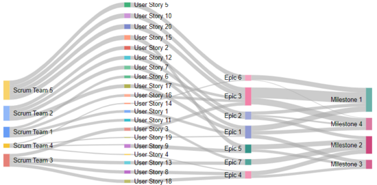
In a Technology Portfolio, the head of the portfolio must be able to assess the status of all projects within the portfolio at any given time. This means that all activities must be accounted for and must align with at least one of the milestones of the portfolio. Tasks that do not align with a milestone do not add value and therefore are considered a waste of resources. At the same time, a Portfolio Manager can compare the planned vs actual resource allocation as well as in what direction each Scrum Team is benefiting the bottom line of the portfolio. In the technology example, each Scrum Team works in individual User Stories, and the combination of the User Stories makes up an Epic. Meaning that even though each team works separately at the User Stories level they might be working together at an Epic level. From a manager's point of view, the diagram can raise red flags visually when User Stories or Epics are not getting the attention needed from the Scrum Teams. This red flag can create an alert for management that more resources are needed in a specific area. These resources could be the need for more Scrum Teams as the workload demands more people or that guidance from upper management is needed to steer the team towards the right direction. In many cases, as portfolios are so big and made up of many platforms with their own subdivisions, a clear view of what the portfolio is collectively working toward is unclear. A Sankey Diagram can serve as an overview dashboard for Portfolio Managers to quickly assess the status of the Portfolio and be able to make decisions for the future quarters. These decisions can be in increasing the workload through the creation of more User Stories and Epics as the teams can produce more, forecasting the number of people that need to be hired to meet deadlines, and refocusing on the milestones with the highest priority for the quarter. The current alternative, due to not having an overview, is that this information must be gathered by having individual meetings with the Scrum Teams to inform of their status and completion of tasks. This process is time-consuming for managers and can create major delays when decisions need to be taken by upper management.
[edit] Programing
Programming software that can be used to create Sankey Diagrams:
- Python
- R
- Plotly
- Google Charts [10]
- Excel
Regardless of the chosen software, the dataset must be prepared. This means that discrete variables with interrelated values need to be collected [6]. The dataset must contain the names of the nodes and the resource amounts and/or types to form the arcs. Depending on the software and the complexity of the data used to create the visualization of the diagram, the software coding can be manual or extracted directly from the dataset. For simple Sankey diagrams where the amount of information and nodes are low, Google Charts is a good option as it does not require any prior dataset formatting. If the data and amount of nodes are overly complex, software like R and Python are a better option but will require previous dataset formatting to achieve the desired look.
For further information of Sankey Diagram Google Charts coding go to https://developers.google.com/chart/interactive/docs/gallery/sankey?hl=en. This website will explain simple and multilevel diagram coding, as well as other superficial features that can be added to the code.
[edit] Limitations
One of the major areas of improvement of the Sankey Diagram must be its level of complexity. This does not refer to the complexity of programming software to create the diagram, but its ability to display information. The diagram is great at tracking immediate transitions, but it lacks when trajectory and traceability are needed. In the case of knowing the likelihood of a scenario happening, the diagram can provide the percentual probability of transitioning from an origin point to an endpoint. But this cannot pinpoint to which symptoms took place to achieve the endpoint.
In project/program/portfolio management, resources can be seen transferring from one node to the next, but the visualization cannot track where the original resource ended. If the goal is to visualize the general flow of resources, the Sankey diagram will suffice. But if a manager wanted to track a specific resource, they would need to track it down in the data set, and even then, unless a resource is tagged from the origin point with a unique ID the complete traceability of the resource will fail. It all comes down to good initial data collection and defining what kind of insights are wanted from it.
[edit] Conclusion
In conclusion, the Sankey diagram is a useful tool to visualize resource flows between actors/activities/projects/etc. It has the ability to easily provide an overview of interrelations within a system, as well as identify areas where the influx and exit of resources are unbalanced. This insight can help stakeholders and decision-makers have a better understanding of the system under study. The diagram can be created in the project definition, as it is ongoing, and/or as a reflective diagram once the project is over. In the case of program and portfolio, the diagram would be used mostly for ongoing/real-time depiction.
The diagram is versatile and can be applied to different scenarios to visualize completely distinct insights. However, the versatility of the diagram does have limitations when it comes to the traceability of the process. If a specific iteration needs to be studied to understand its causes, the diagram does a poor job at tracing. As information is generalized in the flows, an individual data point cannot be identified directly on the diagram. To obtain a trace of resource involvement the dataset used to create the diagram would have to be picked apart to find the path taken from origin point to endpoint.
Even though the diagram was created in 1898, it has recently gathered attention in the last decade. This has led to the development of new applications adapted to the study line it is applied to. The application that has picked my interest is that in risk management, this application has the potential to create benefits and savings for project/program/portfolio managers. In many cases, managers must take an either-or decision, a risk Sankey diagram could help them make the decision by prioritizing the action that could have the most negative direct/indirect impact on the project. This application does require a more extensive study of risk as the direct and indirect impacts have to be identified/studied to deliver the benefits of the risk Sankey diagram insight. It could be argued that the time spent developing this data could be more costly than the effects of the indirect impacts a traditional Risk management assessment would ignore, and therefore it is important to assess the level of uncertainty a project has to determine if superficial risk management or if a more extensive application is needed.
[edit] Annotated Bibliography
In this section, references have been provided for further reading on the topic of the use of Sankey Diagrams in different lines of study.
- Otto, E., Culakova, E., Meng, S., Zhang, Z., Xu, H., Mohile, S., & Flannery, M. A. (2022, January 6). Overview of Sankey flow diagrams: Focusing on symptom trajectories in older adults with advanced cancer. ELSEVIER. https://doi.org/10.1016/j.jgo.2021.12.017
- The article is useful to those who are looking for further explanation of the implementation of Sankey Diagrams to visualize patterns between the data. Even though the article is focused on the implementation of the diagram in a medical setting, the example of identifying patterns between the people observed can easily be transposed with data from employee productivity depending on the amount of time they have working in the same company.
- Romão, M. L., & Correia, P. M. A. R. (2021). New Eyes for an Old Challenge: How the Portuguese Ministry of Justice is Using Sankey Diagrams to Improve Knowledge on the Judicial System Dynamics. International Journal for Court Administration, 12(1). https://doi.org/10.36745/ijca.335
- The article focuses on the benefits the use of the Sankey Diagram had for the Portuguese Justice system. By using the diagram, the Ministry of Justice was able to give participants a better understanding of the justice system. The overview taken in this article is a good example of a program/portfolio application of the Sankey Diagram in real life.
[edit] References
- ↑ "[1]", OriginLab (2021). 28.9.24 Sankey Diagrams. https://www.originlab.com/doc/Origin-Help/Sankey-Diagram
- ↑ 2.0 2.1 "[2]", Kennedy, A. B. W. (1898, January 1). The Thermal Efficiency of Steam Engines. Report of the Committee Appointed to the Council Upon the Subject of the Definition of a Standard or Standards of Thermal Efficiency for Steam Engines: With an Introductory Note. (Including Appendixes and Plate at Back of Volume). Zenodo. Retrieved February 12, 2022, from https://zenodo.org/record/2036163#.YiT1WujMK3B
- ↑ "[3]",Vosough, Z., Kammer, D., Keck, M., & Groh, R. (2018). Mirroring sankey diagrams for visual comparison tasks. Paper presented at the VISIGRAPP 2018 - Proceedings of the 13th International Joint Conference on Computer Vision, Imaging and Computer Graphics Theory and Applications, 3 349-355. doi:10.5220/0006651203490355 Retrieved from www.scopus.com
- ↑ 4.0 4.1 4.2 4.3 4.4 4.5 4.6 4.7 4.8 "[4]", Dave, P. (2022, January 15). 4 use-cases for Sankey Charts - Towards Data Science. Towards Data Science. Retrieved February 13, 2022, from https://towardsdatascience.com/4-use-cases-for-sankey-charts-679b94f7c672
- ↑ "[5]", Soundararajan, K., Ho, H. K., & Su, B. (2014, September 12). Sankey diagram framework for energy and exergy flows. ELSEVIER. Retrieved March 3, 2022, from https://pdf.sciencedirectassets.com/271429/1-s2.0-S0306261914X0019X/1-s2.0-S0306261914008812/main.pdf?X-Amz-Security-Token=IQoJb3JpZ2luX2VjECkaCXVzLWVhc3QtMSJGMEQCIGSuxA1sIgoTuFeNR6GX9YY4KfoWMfO2s%2FOx%2BV1WXiTPAiA%2BcOe15d143LamxslqF70JFQTS1htacokCK0aZX3Z8YyqDBAiS%2F%2F%2F%2F%2F%2F%2F%2F%2F%2F8BEAQaDDA1OTAwMzU0Njg2NSIMIzpUjRleKeZkLySZKtcDMg41%2F3unwoiJEc7CqRnfc%2F%2FDm%2B88Mkse510AKzkGLx%2FIyuvtbwhTYr%2Br6rLfbu5P3IzoXgb6i%2FPBWH8bzKyFYeILrpXPshLALhi%2FHO%2F0CPG5G0nBUMPLJEVFv4Xfj7AuzKunjh9aaYc2o1qoXL1EG%2BNTQfHHnV56%2BKbXam%2Bal5wS1csyEZx4xCIrl1%2F%2FhpbLofmRSvolf1a%2FY8efPUjWEcRwmw3eHWVCduy7bLHNRnl%2BX6jf81Ix6vyoqh4ss81rSNZsEknESDHFx7TmNdSFrPJY60TTcq5r9OT2ieyqd4RpISwim17ynpEf0u6Dbv5knB35QJ5Xzs5u4YacwLc5mZjrf%2F8klAtXxAX9HT9fXsb%2BTySrHGqXnO5VMcvDfnNhTOf80ISjeXo68gG5TpKkkM7HgdmNXCKM1Pz16cu2%2BF2TDiyM%2Fq6AcYkz8sC3ny0VVxtBdZNba1XtJwAL5iT3giRxJjJG3fR%2BpIt1g3HGu2K%2Bb8elAANDAOFblyQGDQTXTULOgW%2B5v2AwwJ7usZPvVM0ubxibk1DTnY7bT62zdEEEIKkSxZ1jewyTlMyMU12hCODMIk56EtPgR4KFOZ4S%2BEgjQkYHoZ1K%2FUy2otDaZ%2BIu%2F09hkqE%2FMLXJk5EGOqYB4UGjxIa6H6n3hYEsq9FAfhdC6o53X%2FhHDTKoOYHvlE2HyGUVmL6b3sZpfcPyYZ19IOdcqKfPePQ%2BeW27FhTHp%2F0180pQBunl9mGB%2FkJ3eEPLxOHiueofx4sVL3ld6g5l7drbxx%2FdFRzb93Xm8TlaKSVFzZbDxbHS%2FU9ijgUSpTuNnXX8LJRRNsoRyQN082%2BV0ffAnaklkIeqV1tKhZ3uGrFK262lFg%3D%3D&X-Amz-Algorithm=AWS4-HMAC-SHA256&X-Amz-Date=20220306T173619Z&X-Amz-SignedHeaders=host&X-Amz-Expires=300&X-Amz-Credential=ASIAQ3PHCVTYUUZN7OGY%2F20220306%2Fus-east-1%2Fs3%2Faws4_request&X-Amz-Signature=237277033185fe7fde9ec90da29c80d28d6371109358885478a8cacc2a850b7f&hash=a51b47eac5b95a2d4927228116e077fb609937c36997537075bfcd535a982244&host=68042c943591013ac2b2430a89b270f6af2c76d8dfd086a07176afe7c76c2c61&pii=S0306261914008812&tid=spdf-ee17f957-67d2-43ad-92d7-52796af33290&sid=46e2480c290a95453478d784a81b2811e994gxrqb&type=client&ua=570451010b01545903&rr=6e7cda56cae97367
- ↑ 6.0 6.1 Otto, E., Culakova, E., Meng, S., Zhang, Z., Xu, H., Mohile, S., & Flannery, M. A. (2022, January 6). Overview of Sankey flow diagrams: Focusing on symptom trajectories in older adults with advanced cancer. Journal of Geriatric Oncology. ELSEVIER. Retrieved March 6, 2022, from https://clinicalkey.udemproxy.elogim.com/#!/content/playContent/1-s2.0-S1879406821006639?returnurl=null&referrer=null
- ↑ Mathis, B., Ma, Y., Mancenido, M., & Maciejewski, R. (2019). Exploring the Design Space of Sankey Diagrams for the Food-Energy-Water Nexus. IEEE Computer Graphics and Applications, 41(2), 25–34. https://doi.org/10.1109/MCG.2019.2927556
- ↑ "[6]", Atlassian, & Rehkopf, M. (2022). Epics, Stories, Themes, and Initiatives. Atlassian. Retrieved February 20, 2022, from https://www.atlassian.com/agile/project-management/epics-stories-themes#:%7E:text=Stories%2C%20also%20called%20%E2%80%9Cuser%20stories,drive%20toward%20a%20common%20goal.
- ↑ "[7]", Editorial Team. (2021, November 2). A Guide To Scrum Teams. Indeed. Retrieved February 20, 2022, from https://www.indeed.com/career-advice/career-development/scrum-team#:~:text=A%20scrum%20team%20is%20a,is%20no%20rank%20or%20hierarchy.
- ↑ "[8]", Google Charts. Sankey Diagram. 20 February 2022. https://developers.google.com/chart/interactive/docs/gallery/sankey
