Work break down structure (WBS)
Abstract
Contents |
Introduction
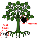
Process of Root cause Analysis
Root cause analysis tools
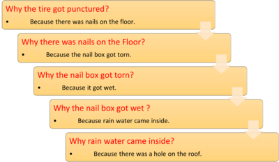
Five Why analysis
Steps to perform five why analysis
- Take a particular problem
- Question “WHY” it occurred and note down the answer.
- If that is not the exact root cause then you can ask another “WHY” question to that answer .Note down the new answer.
- Follow these steps till you identify the root cause. It can take any number of “WHY” to reach the cause. [3]
Example
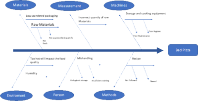
Fishbone diagram
Steps to analysis fishbone diagram
- Determine and state the effect or the problem that has to be analyzed.
- Determine the primary causes or categories of the effect.Methods, machines, people, materials, environment or measurements are popular primary causes.
- Under each primary categories identify the other sub causes on it. Sub causes can be identified through various methods like five why analysis or 4Ps method (Policies, Procedures, People and Plant)
- This procedure of analyzing each cause is repeated until the problem's root causes are found. The team then analyzes the fishbone diagram until a conclusion and future steps are reached.[5]
Example
Scatter chart
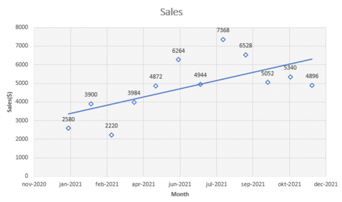
Scatter chart represents the relationship between dependent and independent variables for the root cause. The dependent and independent variables data is represented by numerical value. [7]
Steps to create a scatter plot
- Choose two variables to analyze (Pair of dependent and independent variables).
- Measure the equivalent value of the dependent variable for each value of the independent variable.
- On the chart, plot the numbers from each data pair.
- On the horizontal axis, place the independent or expected cause variable, and on the vertical axis, place the dependent or intended effect variable.
- In the chart, plot and examine the acquired data values. [7]
Example
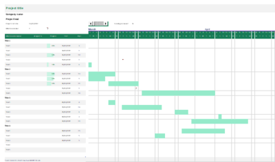
Gantt charts
Steps to create a Gantt chart
- Make a list of all tasks and activities.
- Calculate the latest finishing date and the earliest start date for each activity, as well as the duration and any interdependence on other activities.
- Arrange the tasks in a blank Gantt chart, with the timeline indicating the project's overall duration.
- Draw bars that match to the duration of the activities to schedule them.
- Use diamonds to represent plan milestones. [7]
Flowcharts
Flowchart represent the process flow which was used through a simplified representation. [7]
Steps to create flowcharts
- Gather all of the team members in the process in a meeting room with a whiteboard and plenty of colorful sticky note
- Define the process's beginning and end points, as well as the borderline between other parallel processes.
- List the primary actions or tasks that were completed during the procedure
- Use different colored adhesive notes to represent actions, items, documents, and other process elements.
- Draw a diagram of the process by shifting the notes about on the board until they reflect the most accurate representation of the process. [7]
Symbols
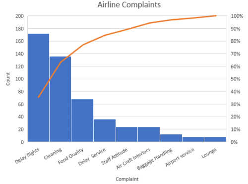
Pareto analysis
Png over a considerable amount of time. It also supports in handling multiple organizational challenges. [9]
Steps to perform pareto analysis
- Collect the number defect occurrence.
- Sort that data from highest to lowest based on the number of occurrences.
- Calculate the cumulative percentage.
- Plot a bar graph where X-axis is the defect causes and Y-axis is the cumulative percentage.
- Plot another line graph in that bar graph for the cumulative percentage.
- To separate the important root cause draw a line from Y-Axis at 80% to the line graph and then drop to the X-Axis. The causes that are left side to the line are the 80% defect driving factors. [8]
Example
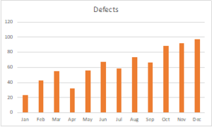
Histogram
Steps to create a histogram
- Split the obtained data into an appropriate number of categories if it hasn't already been done.
- Make a bar chart with area for the number of data categories on the X axis and the maximum data point on the vertical axis.
- For each data point, make a bar with a height that matches to the recorded data.
- Look for trends in the histogram results. Reevaluate the number of categories and the data division into the categories if your result with a graph with very few bars, all bars almost equal, or a comb-like design. [7]
Example
Brainstorming
The goal of brainstorming is to generate as much thoughts as possible which are probable factors for the event under study, even wild ideas. [7]
Steps to do brainstorming session
- Get a whiteboard or a flip chart to write down your ideas.
- Encourage everyone to engage by opening the stage to attendees for the intent of launching ideas.
- Make a list of all the ideas you've come up with, using the same language as the original proposal.
- During the session, don't really debate, criticize, or evaluate ideas.
- Allow for a period of stagnation in the flow of thoughts because it will generally take up again; end the session when very few fresh ideas come.
- Sort ideas into categories of decreasing importance to review them. [7]
Impact effort matrix
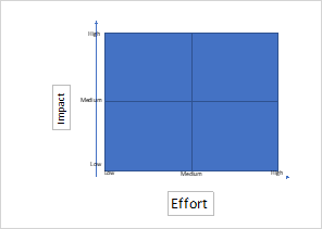
It's a method for determining which of many possible solutions should be executed. It shows which ideas look to be the simplest to implement and which have the greatest impact. [7]
Steps to create the Impact effort matrix
- Lookup past discussions' possible solutions.
- Create a blank diagram, dividing it into four quadrants, with the effort necessary to implement the solution on the x axis and the impact of the approach on the y axis.
- Evaluate effort and impact, and then position each option in the graph based on your findings. To identify each reason, use figures, shades, or titles.
- The options in the upper left quadrant will provide the best value and should be prioritized. [7]
Example
Significance of root cause analysis
- For a long team perspective, Root Cause Analysis is typically helpful in discovering and identifying defects as well as their fundamental causes and remedy can be found, reducing the risk of recurrence .
- It helps with the development of a logical approach to solving issues.
- After determining the primary source of the problem, one will attempt to determine and identify important problem-solving methods using information currently available. Once the fault has been identified, we can decide what adjustments are necessary to enhance quality.
- We can identify existing and future needs for organizational and system development.
- It also aids in the development of repeatable and acceptable step-by-step procedures, where one process may corroborate the outcome of another. [10]
Limitations of Root cause Analysis
- The primary issue with Root cause analysis is that it only assumes, or focuses on, one root cause of failure. However, in fact, the issue may be more complicated. There might be several underlying causes for a fault. As a result, one must concentrate on all areas of the fault and consider the underlying causes of the issue.
- Few root cause analysis tools like fishbone diagram or five why analysis doesn’t use data or other statistical tools, so without data the outcome won’t be more reliable
- The brainstorming process might create both irrelevant and relevant underlying factors, causing confusion and wasting time.
- Multiple components in complex diagrams might result in a confused mess that is difficult to show in a fishbone chart.
- Root cause analysis alone would not give any results, it has to be used as part of a bigger problem-solving effort aimed at improving quality.[10]
Thinks to know
- The information you gather will determine the quality of your root cause analysis.
- Before you can know why something happened, you must first know what really happened.
- Sometime lack of knowledge of tools can be a obstruct of root cause analysis.
- Even when the main cause is identified, people frequently fail to recognize good corrective steps.
- All investigations do not have to be identical (but some processes can be ignored).[11]
Annotated Bibliography
1.Root Cause Analysis Handbook: A Guide to Efficient and Effective Incident Management, 3rd Edition by ABS Consulting , Lee N Vanden Heuvel , Donald K Lorenzo , Walter E Hanson
2.The ASQ Pocket Guide To Root Cause Analysis, Bjørn Andersen, Tom Natland Fagerhaug
3.Root Cause Analysis: A Step-By-Step Guide to Using the Right Tool at the Right Time 1st Edition,by Matthew A. Barsalou
References
[1]WHAT IS ROOT CAUSE ANALYSIS (RCA)? By ASQ
[2] 5 Whys by mindtools
[3] 5 Why Training Slides by slide share
[4] Fishbone Diagram by Cairo University
[5] Fishbone Diagram by Whatis
[6] Examples of Fishbone by wall street mojo
[7] The ASQ Pocket Guide To Root Cause Analysis, Bjørn Andersen, Tom Natland Fagerhaug
[8] Pareto analysis by slide share
[9] Advantages and Disadvantages of Pareto Chart – geeks for geeks
[10] Advantages and Disadvantages of Root Cause Analysis - geeks for geeks
[11]Root Cause Presentation Tampa
