Bubble diagram in portfolio management
Developed by Marco Carloni
The bubble diagram or bubble chart (BC) is a graphing technique used in project portfolio management to making decision, especially to display balance in new product project portfolios.
These visual representation is an adaptation of the four quadrantBCG (star; cash cow; dog; wildcat) diagrams developed in 1970 by Bruce D. Handerson as strategy models [1].
The diagram is a variant of the regular x-y plot, where circle or ellipse are used instead the single points, and extra information are provided by varying the shape, the size and the colour. Furthermore the chart can usually be divided in four section to facilitate recognition of different situations.
This method is widely used by the companies even if just a small percentage use it as the dominant.
The most popular chart is the risk-reward which shows the probability of success on the vertical axis and the NPV ( Net Present Value) over a period of time on the horizontal axis.[2]. For this chart, four different categories will be analyzed : Pearls, Oysters, Bread & Butter and White Elephants.
Moreover different types of bubble diagrams using other parameters will be mentioned in the article.
Overall this article aspirates to perform an overview of the bubble diagram method and its uses through :
- One example with the purpose of understand the importance of the method and the possible applications in a real case.
- Brief description of other visual tools and differences from bubble chart
- Different methods as the financial methods, strategic methods and scoring model. [3]
At last the advantages and the disadvantages of this method will be analyzed and then will be discussed if actually can give a real help to the decision making in portfolio Management.
Introduction to visual tools and portfolio management

Traditional project management is a process whereby each project is approved and managed independently focusing on the triple constraint (scope, time, cost) of the single project separate from other projects. [5] By contrast portfolio management is a dynamic decision process, whereby a business’s list of active new product (and development) projects is constantly updated and revised. In this process, new projects are evaluated, selected and prioritized; existing projects may be accelerated, killed or de-prioritized; and resources are allocated and reallocated to active projects. The emphasis of portfolio management is on ensuring that each project contributes to the overall organizational success. [6]
To achieve this success, many different tools and methods are used.
Below the main goals settled by using portfolio management are listed and the importance of the bubble charts to reach few of them is highlighted [7] :
- Maximize the value of the portfolio for a given resource expenditure.
- Maintain the competitive position of the business.
- Balance choosing the right mix of projects : for this point, the use of bubble diagram and other visual tools is important in order to reach the best results.
- Achieving a strategically aligned portfolio : also for this goal, the bubble chart results really useful.
- Achieving the right number of projects for the limited resources available.
Bubble diagram

Bubble charts are useful graphs for comparing the relationships between data objects in more than 2 numeric-data dimensions: the X-axis data, the Y-axis data, and the other data represented by the bubble size, color and shape.
As will be highlighted in the next chapters, visual charting techniques in portfolio management projects (as bubble diagram) are employed in order to display balance and reach the right mix of projects in new product project portfolios.
In order to avoid misleading charts, is important to understand the relationship between the bubble size and the data represented by the size. In the common case of circular bubbles, if the data is proportional to the radius, the data will be altered since the bubble area grows exponentially as the square of the radius (<math> Area = \pi* r^{2}</math>). For a better representation of the data, bubble data should be represented directly by the area using the circumference of the circle, in this case the bubble grows linearly in relationship to the diameter (<math>circumference =\pi*diameter</math>). However, sometimes if one wants to exaggerate the differences or a more easily contrast between two projects, could be useful represent the data proportional to the radius. [8]
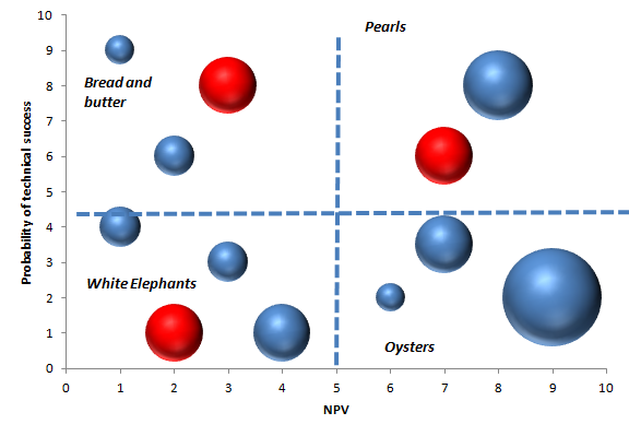
The most widely used and highly popular bubble diagram in portfolio management is the one that displays project risk (probability of success) on y axis and reward on X axis as shown in Fig.2.
Risk - Reward bubble diagram
The risk-reward portfolio mapping involves keeping the projects into various categories as per the quadrant they fall into. As mentioned before, each quadrant correspond to a different situation distinguished from the others by a particular name. Below a brief description for every quadrant is reported:
- Bread and Butter (upper left): These type of projects have high probability of success but low reward. They are small, simple projects which include extensions, modifications, fixes and updating.
- White Elephants (bottom left). These are the projects with low probability and low reward. Every business wants to avoid them, but inevitably there are always few and they are difficult to kill.
- Pearls (upper right quadrant): Most businesses aspire more of these. These are the potential star products, projects with a high probability of technical success, and which are also expected to give a very high reward.
- Oysters(bottom left): These are the long-shot projects, where high reward is expected, but as the same time also a low probability of technical success. These are the projects where technical innovations will open the way for solid payoffs. [8]
A practical example
An example of bubble diagram is shown in Fig.2 where the size of each bubble shows the annual resources spent on each project (Euros per year or people or work-months allocated to the project) and the color shows the timing :
Also the different colors have different meaning : the red color is for projects with imminent lunch, while the blue colors represents an early stage project.
This example will be analyzed and the information obtained from it will be explained; this will be helpful to have a general idea on the practical use of the bubble diagram.
In Fig.2 is possible to notice a high number of White Elephants which means that many resources are used for low-return projects and from a business point of view can be considered a waste of money, people, facilities etc. For this reason they should be reduced in number and dimension as much as possible.
Moving to the right, in the Oysters zone, there are three bubbles of different dimension; Overall it can be noticed the presence of good investments for the resources and a sufficient number of projects, which mean good possibility of innovation in the future. Furthermore it may be notice how all the three bubbles have a blue color which means they are early stage projects.
Looking at the Pearls, is easily visible the lack in number of projects more than quantity of resources used for a single project. There are just two Pearl projects, and for one of them considerable resources have been allocated(denoted by the sizes of the circles). Therefore the business should focus more on it and try at least to have few more projects here.
In the end it is important keep an eye on Bread and Butter quadrant in order to try to avoid big bubbles, which means much money and resources spent for low value projects. Here, the number of bubbles and their dimension are under control and the businesses should always try to keep this situation through a good optimization of these kind of projects.
A relevant feature of this chart is that forces management to consider the resources implications and deal with it as well as the timing.
Given finite resources (e.g., a limited number of people or money), the sum of the areas of the circles must be a constant. That means , if you add one project to the diagram, you must subtract another; alternatively you can shrink the size of several circles.
Thus, this apparently simple risk/reward diagram shows a lot more than simply risk and reward data: it also shows resource allocation, timing and the balance between the projects. In project portfolio, using the bubble charts can be a great help in making insightful business investment decisions, even if they should never stand alone but always with some other tools.
Different types of bubble diagram
Besides the most common risk – rewards chart, many other parameters could be used with the bubble charts in order to provide different information. Below the table show the most popular parameters used in the bubble charts (research conducted in 1997-1998) [3]:
| Chart Type | Y-Axis | X-Axis | % of businesses using this approach |
| Risk vs. Reward | Probability of Success | NPV, Total benefit after years of launch | 44,4 |
| Newness | Market newness | Technical newness | 11,1 |
| Ease Vs. Attractiveness | Market attractiveness (growth, potential consumer appeal, life cycle) | Technical feasibility | 11,1 |
| Strengths Vs. Attractiveness | Market attractiveness (growth, potential consumer appeal, life cycle) | Competitive position | 11,1 |
| Cost Vs. timing | Time to impact | Cost to implement | 9,7 |
| Strategic Vs. Benefit | Business intent, NPV, attractiveness | Strategic focus or fit | 8,9 |
| Cost Vs. benefit | Cumulative development costs | Cumulative Reward | 5,6 |
Variant of Bubble chart

Some variants of the bubble diagram exist as well; one of them is used to effectively describe uncertain estimates.
For each project there are optimistic and pessimistic estimates taking into account uncertain variables, leading to a range of values both for NPV and probability of technical success. In this case as shown in Fig.2 , besides the round bubbles there are large ellipses due to the uncertain variables of "NPV" or "The probability of success". The size and the shape of the bubble present the uncertainty of projects: very small bubbles mean highly sure estimates on each dimension, instead large ellipses mean high uncertainty (a big range between worst case and best case) for that project. [9]. This variant of BC ( Bubble Chart) is important to understand how precise are the expectation about a specific project, moreover give also the possibility to understand the possible risks once has been decide to invest on it.
Strength and weakness
The BC cannot be made before all the data have been collected and processed. In the literature, there are almost no studies regarding the exact effect of the chart in use. It is moreover impossible to generalize and conclude generically whether the BC gives benefits implementing in a company. In order to get an overview, a list of advantage and disadvantages is conducted. This list could be useful to understand in which situation bubble diagrams would be easy to implement and use, and in which situation the implementation of such a chart can be a costly and non-benefiting project.
Strength
- Efficient when many different processes are running at the same time :
It’s a really useful tool to have a fast overview for decision making, especially when you have to take in consideration many different projects at the same time. Give the possibility to compare many similar projects in a short time and get fast conclusions. As mentioned before, in this way the bubble chart represent a good tool for reach the balance choosing the right mix of projects.
- Easy to use :
Really easy to implement in many different project situation and possibility to make it in a short time. There is no need of any specialist to make it and analyze it.
- Easy to learn :
Since this visual tool is basic and simple, the employees can learn how to use it in a fast way and without needing any special crash course. Furthermore this means there are not expenses to implement it.
- Easy to update, modify and maintain :
Since is a visual chart, it’s fast and low cost to maintain and update due to the changing of data.
Weaknesses
- Dependencies and project synergy are not showed :
The bubble diagrams cannot show the dependency between different projects, so it won’t be the best tool to use in case there is big number of projects with many interdependencies which are need to be investigated. As the same time, also under the cost profile will be important to know if it is possible to share some steps between different projects in order to decrease the all expenses.
- Difficulties to find errors in data :
The diagram count directly on the data and in the case one error occur in the data, will be hard to find out where the bubble diagram will be wrong . Furthermore if one mistake has been done with the data, it will show up several times making this system weaker .
- Difficulties to quantify the data :
This tool is more useful to give an overview of the projects than give the exactly values about the risk, rewards and other parameters. To find the values for the NPV for example, in every project the values should be calculated and put on the scale between 1 and 100, even if is known that in some projects could be almost impossible to quantify.
- Difficulties to compare different kind of project :
It is always hard to compare different types of project as the same time like for example strategic projects and product-development project. Both types of project are important and can be of great value, but the NPV of strategic fitting projects is hard to know, and the product-development project will often seem more popular.
Other visual tools for Portfolio Management

Besides the Bubble charts, there is a large variety of histograms and pie charts which help to portray portfolio balance too. Furthermore there are plenty parameters or variables across which one would like to look to for the balance of a project. Here some examples of variables and charts are reported:
Timing is a important parameter to take in consideration for balance. Usually is important to find a balance between short term and long term projects, in this way will be possible to have constant stream of new products launch spread over the years and no a sudden log-jam of product launches all in one year. For the timing variable, a histogram could be a good choice since captures the issue of timing and illustrate the distribution of resources for specific projects according to the time of launch.
Another variable connected to the timing is the cash flow. Here the aim is to balance the projects in such way that allow to have a cash inflows reasonably balanced with cash outflows in the business. Also here is possible to use a histogram where the inflows and the outflows are showed for every project.

Besides timing, the different project types is another big concern.
How is possible to check the amount of resources spent on development of new products versus product renewals (improvements and replacements), or product extensions, or product maintenance? Here another visual tool is used : pie charts are easily understandable and fast interpretation, moreover they effectively capture the spending split across project types. Furthermore the pie charts are used also to displaying market segments, product lines and technologies.
Comparison to other Portfolio methods
After mentioned few different visual methods for portfolio management, in this section other popular methods will be briefly described and compared to each others in order to understand what are they useful for and in which cases one is better than another.
The most common methods are the financial methods, 77.3 percent of businesses use this approach in portfolio management and 40.4 percent of businesses use this as the dominant method. In this article these methods won't be thorough but just used to compare the performance with the BCs.
Famous methods are also the strategic approaches: for instance, it is useful to use it in order to decide how to allocate the money across different types of project or envelopes, developing a business’s strategy and ranking the project by different parameters. A total of 64.8 percent of businesses use this approach and for 26.6 percent of businesses, this is the dominant method.
Another category is give by the scoring model where formulas assigns points based on known information to predict an unknown future outcome. So scaled ratings are used to produce a Project Attractiveness Score which becomes the criterion used to make project selection and/or ranking decisions. These models are used by 37.9 percent of businesses and in 18.3 percent, this is the dominant decision method.
The last group of approaches presented are the Check lists: It is easily understandable, the projects are evaluated on a set of yes /no questions. In order to proceed with a project, a certain number of approves (yes) needs to be reached. The number of Yes’s is used to make Go/Kill and/or prioritization (ranking) decisions. Only 17.5 percent of businesses use check lists and in only 2.7 percent is this the dominant method. [3]
All these methods have different approaches and furthermore they are used in different situations to achieve the best results in portfolio management. Below the table is comparing the different methods and showing what kind of activities and performance want to be prioritize using a certain method compare to another.
In the table cells the numbers from 1(poor) to 10(excellent) are used to rating each method.
| Activities and performance | Bubble diagrams | Scoring model | Financial methods | Strategic methods |
| Portfolio with good balance of projects | 7 | 7 | 5.5 | 6 |
| Portfolio aligned with business's objectives | 8 | 7.5 | 7 | 8 |
| Portfolio containing high value projects | 7 | 7.5 | 6.5 | 7.5 |
| Spending reflects the business's strategy | 6 | 7 | 7 | 7.5 |
| Portfolio with right number of projects | 5 | 5.5 | 5 | 6 |
| Projects are done on time | 6 | 6 | 5.5 | 6.5 |
It’s important to highlight that the popularity does not necessarily means that one method is better than another one. When different performances have been rated on six metrics, companies that mostly relied on financial tools as the dominant portfolio selection, score the worst. Popularity does not necessarily equate to effectiveness, however. Financial tools are useful in many projects but also bring to an unbalanced portfolio of lower value projects; and projects that lack strategic alignment. By contrast, businesses using bubble diagrams obtain a balanced and strategic aligned portfolio as the same as strategic methods. In the end, scoring models present the best result for selecting high value projects, and also yield a balanced portfolio.
Conclusion
Talking in account what has been said before, it is clear how the bubble diagram is a useful visual tools to have balanced and aligned project portfolio management. However it’s important to clarify the Bubble chart cannot be used alone for decision making since does not give enough information , instead should be combined with other tools. It’s also relevant to keep in mind that this visual tool doesn’t show any dependencies and comparison between different projects, furthermore the timing variable needs to be introduced by other visual tools. BC is a simple and fast way to have an overview and can help in decision making when previous processes already exist and many data are given
Bibliography
To write this article, many different sources have been used in order to explain the topic in all its aspects.
Furthermore it is important to point up that most of the material comes from different articles published by the same authors : Cooper, R.G., Edgett, S., Kleinschmidt.
References
<references> [1]
- ↑ 1.0 1.1 B.D. Handerson, The Experience Curve - Reviewed IV. The Growth Share Matrix or The Product Portfolio.
- ↑ 2.0 2.1 R.G. Cooper, S.J. Edgett, E.J. Kleinschmidt, R&D Portfolio Management Best Practices Study, Industrial Research Institute (IRI), Washington, DC., 1997.
- ↑ 3.0 3.1 3.2 3.3 3.4 R.G. Cooper, S.J. Edgett, E.J. Kleinschmidt, Best practices for managing R&D portfolios, 1998.
- ↑ 4.0 4.1 https://s3.amazonaws.com/static.written.com/core-3-project-constraints1463028488.png
- ↑ 5.0 5.1 Parviz F. Rad, Ginger Levin "Project Portfolio Management Tools and Techniques", 2006 , 10-13
- ↑ 6.0 6.1 R.G. Cooper, S. J. Edgett, E.J. Kleinschmidt, “New product portfolio management:practices and performance”, Journal of Product Innovation Management, 1999, 333-351.
- ↑ 7.0 7.1 R.G. Cooper, S. J. Edgett, E.J. Kleinschmidt, “Portfolio management in new product development: lessons from the leaders – Part I”, 1997, 16-28; Part II, 1997, 43-57.
- ↑ 8.0 8.1 8.2 Bubble Chart Pro™ software
- ↑ 9.0 9.1 Tritle, G.L., “New Product Investment Portfolio”, internal 3M document